Mastering the Art of Creating Professional Blog Banners
The Importance of a Well-Designed Blog Banner
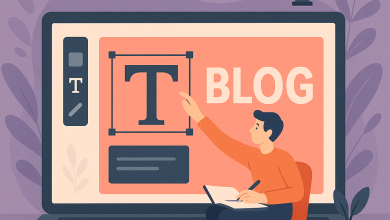
In today’s digital age, first impressions are often made in the blink of an eye. For bloggers and content creators, the banner image of an article serves as the front door to the content house. A well-designed blog banner not only catches attention but also conveys the essence of the content being presented. As such, creating a visually appealing and effective blog banner is crucial to engagement and content success.
Choosing the Right Colors and Typography
The selection of colors and typography plays a pivotal role in crafting a blog banner that stands out. In a professional setting, using a soft cream-beige background with bright orange accents is a combination that can evoke a sense of approachability and creativity. Orange, with its vibrancy, naturally draws the eye, while the cream-beige base provides a warm and inviting canvas.
Typography, particularly in the context of business blogging, should be clean and modern. A sans-serif font in bold with a stark black hue contrasts sharply against the lighter background, ensuring that the heading text is legible and compelling. The use of all-caps for headings can create a sense of urgency and importance.
Incorporating Visual Elements
Visual elements should complement the text and reinforce the theme of the blog post. On the right side of the banner, realistic graphics that pertain to the topic at hand can bring the design to life. For instance, floating 3D business graphics can provide depth and interest, subtly guiding the viewer’s gaze from left to right.
The background should not be overlooked either. A cream gradient with abstract orange corners can add a dynamic element without overwhelming the composition. Additional features like halftone dots on the left and dotted connection paths can suggest interconnectivity and modernity, appealing to a tech-savvy audience.
Balancing Composition and Style
Striking the right balance in a blog banner design involves more than just aesthetic considerations; it’s about functional design that boosts engagement. The composition should be clean and not overcrowded, with plenty of whitespace to prevent the design from feeling clattered. Each element should serve a purpose, whether it’s drawing attention, supporting content, or enhancing the overall layout.
- Elements should align harmonically to guide the viewer’s eyes naturally from left to right.
- Whitespace is crucial for creating focus and avoiding visual overload.
- Lighting and shadows can add realism and dimension, enhancing the visual hierarchy.
Avoiding Common Pitfalls
One of the most common errors in blog banner design is including unnecessary elements such as logos, watermarks, or excessive text. These can distract from the main message and reduce the professionalism of the design. Sticking to the core elements—heading text and related visuals—ensures clarity and coherence.
Moreover, ensuring that the design is both export-ready and adaptable for various digital platforms is essential. This means designing with multiple screen sizes and resolutions in mind, retaining quality and readability across devices.
Conclusion
A blog banner acts as the gateway to your content. By utilizing strategic color schemes, clean typography, and relevant visuals, you can create an engaging and professional introduction to your blog. This not only attracts viewers but also sets the tone for the quality and caliber of content they can expect. In a competitive digital landscape, mastering the art of blog banner design is an investment in your content’s reach and reputation.